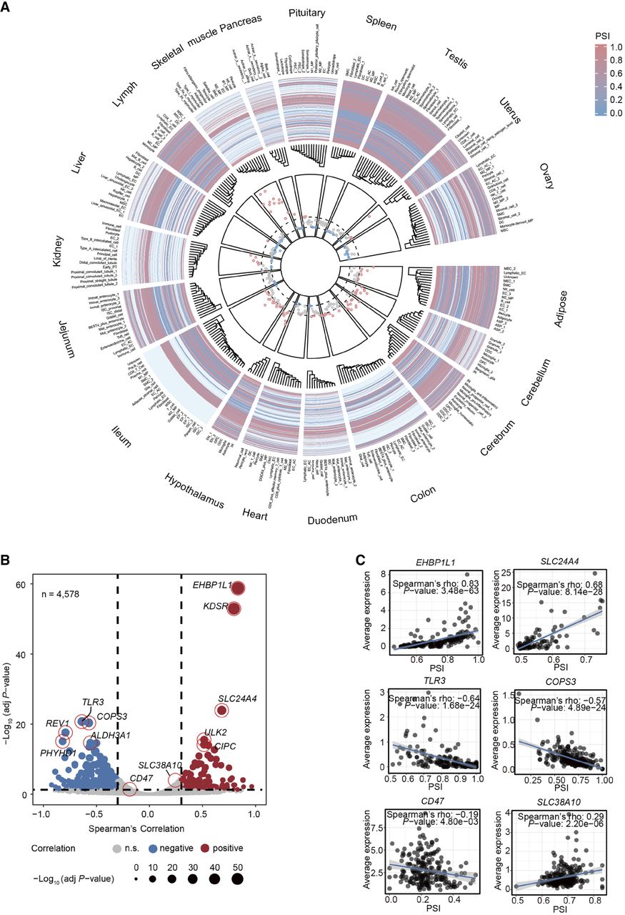
Landscape of global 3′ UTR usage across 261 cell types. (A) The circular plot summarizing APA trends across 1231 genes. The outer heat map track illustrates the variation in 3′ UTR length among genes for each tissue and cell type (red indicates higher PSI values, and blue indicates lower PSI values). In the inner ring, points represent the median PSI values of all genes for each cell type (261 cell types in total), with red points indicating high PSI (>0.5235), gray points indicating medium PSI (0.5000–0.5235), and blue points indicating low PSI (<0.5000). The dashed lines represent these thresholds. (B) Volcano plot showing Spearman's correlation between PSI and average expression level for each gene. Points are colored by correlation category: negative (blue, Spearman's ≤ −0.3 and adj P-value < 0.05), n.s. (gray), and positive (red, Spearman's ≥ 0.3 and adj P-value < 0.05). (C) Scatter plot of PSI and average expression level for EHBP1L1, SLC24A4, TLR3, COPS3, CD47, and SLC38A10. Each dot represents one cell type.