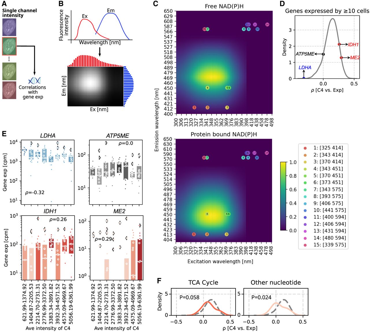
SpectralSeq generates hypotheses about cell metabolism. (A) Schematic of workflow to correlate a single channel intensity with gene expression. (B) Schematic plot of constructing spectra matrix using the excitation and emission spectra. (C) Spectra matrices of free (top) and protein-bound NAD(P)H (bottom). Dots represent the positions of the 15 hyperspectral channels according to the excitation and emission wavelengths, and numbers inside the dots correspond with the channel number in the legend box. (D) KDE plot of correlation coefficients between spectra intensities in channel 4 and gene expressions for genes expressed by ≥10 cells. Four genes with negative, ∼zero, and positive correlation coefficients are labeled. (E) Box plots showing the gene expression (cpm) in every 15 cells ranking with spectra intensities in channel 4 from smallest to largest of genes in D. Each dot represents a cell, and box color is coded by the median expression in each bin. Box plots’ horizontal lines indicate the first, second (median), and third quartiles. Spearman's ρ-values: LDHA=4.47 × 10⁻⁴, ATP5ME = 0.994, IDH1 = 0.004, and ME = 0.001. (F) KDE plots showing the correlation coefficients between spectra intensity in channel 4 and gene expression of genes involved in two cellular metabolic pathways. Vertical gray dashed lines indicate correlation coefficient of −0.5, 0, and 0.5, and the horizontal gray dashed line indicates a KDE density of 5. The gray dashed curve presents the KDE distribution for all genes in the pathway (as in D). The color of the KDE distribution is coded by the correlation coefficient of the peak.