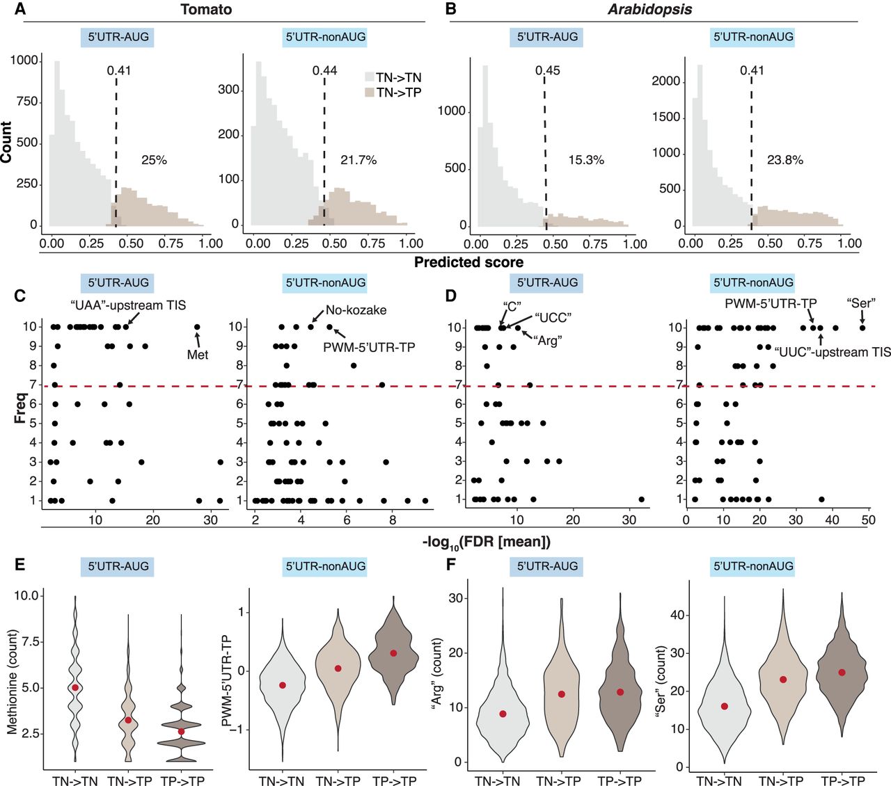
The features of misclassified TN TISs. (A,B) Prediction score distribution of the TN TISs for the 5′ UTR–AUG and 5′ UTR–nonAUG TIS groups in tomato (A) and Arabidopsis (B). The mean threshold (dashed lines) for the classification of TN → TN (the TN TISs predicted as TNs; gray) and TN → TP (the TN TISs predicted as TPs; light brown) and the mean percentage (%) of the TN TISs misclassified as TP (TN → TP group) derived from the best models in the 10 randomly balanced data sets (as indicated in Fig. 1) are shown. (C,D) Dot plots show the frequency (y-axis) of a given feature used for TIS prediction in 10 randomly balanced data sets and the feature enrichment (FDR; x-axis) between the TN → TN and TN → TP groups for the TIS groups indicated in A,B. The red line represents the threshold (frequency of seven or more) of important features as indicated in Figure 2. (E,F) Violin plots show the feature value distributions for the features of methionine counts or PWM–5′ UTR–TP and “Arg” or “Ser” that were most enriched in C,D for the TN → TN (gray) and TN → TP (light brown) groups, indicated in A and the TP → TP (the TP TISs predicted as TPs, dark brown) group. The red dot represents the median value.