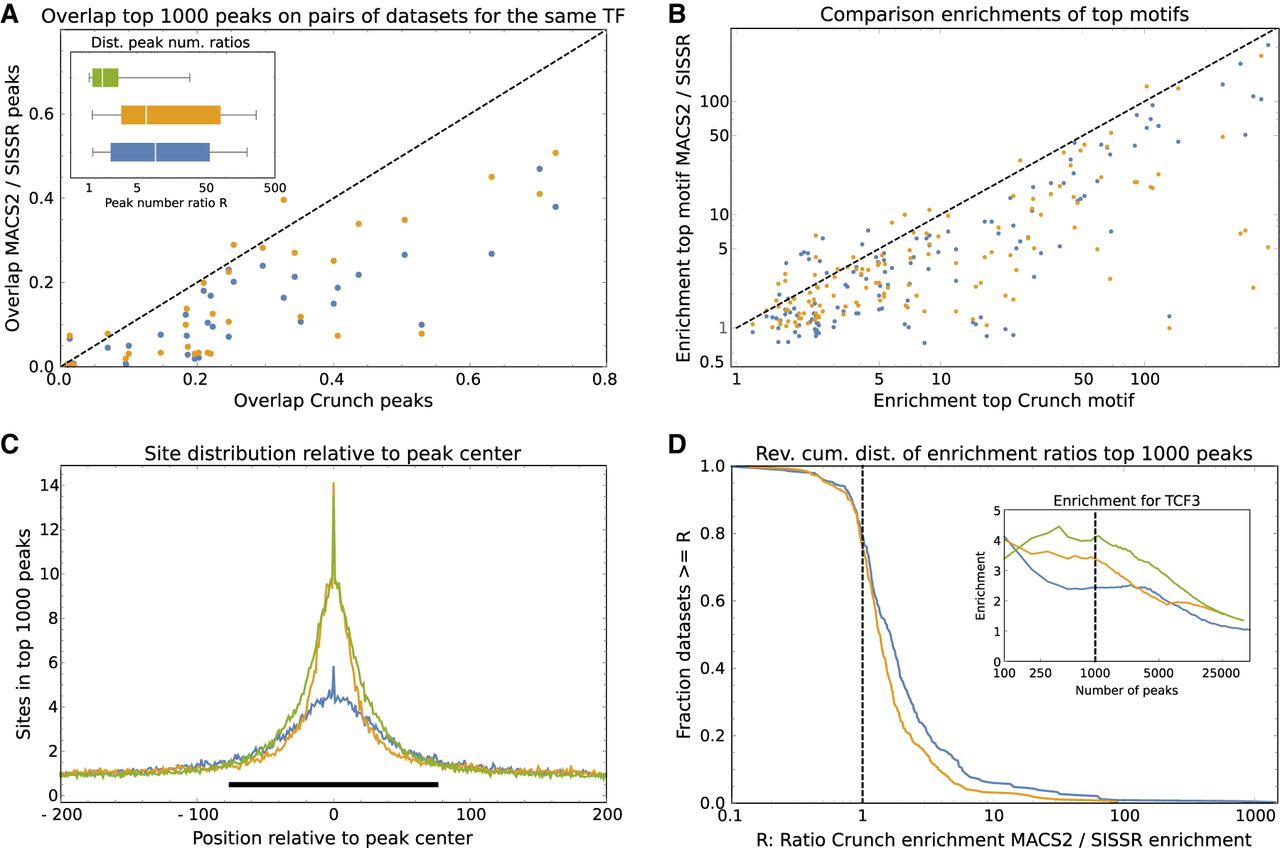
Comparison of the peak predictions of Crunch, MACS2, and SISSR. (A) For each of the 31 pairs of data sets for the same TF, the overlap of the top 1000 peaks predicted by Crunch on the two data sets is shown on the horizontal axis versus the overlaps of the top 1000 peaks predicted by MACS2 (blue) and SISSR (orange) on the vertical axis. The dotted line shows y = x. The inset shows box-whisker plots of the ratios R of predicted peak numbers for pairs of data sets for the same TF for Crunch (green), MACS2 (blue), and SISSR (orange). (B) Enrichment of the most enriched motif in the top 1000 peaks of Crunch (horizontal axis) versus enrichment of the most enriched motifs in the top 1000 peaks of MACS2 (blue) and SISSR (orange). The dashed line shows the line y = x. (C) Average number of sites for the most enriched motif in the top 1000 peaks of Crunch (green), MACS2 (blue), and SISSR (orange) as a function of position relative to the peak's center. The black bar shows the region [−75, 75]. (D) The inset shows enrichment of Crunch's top motif as a function of the number of top peaks for Crunch (green), MACS2 (blue), and SISSR (orange). The dashed line shows the enrichments for the top 1000 peaks. The main plot shows the reverse cumulative distribution of the ratio of site enrichment in Crunch's top 1000 peaks versus enrichment of the same motif in the top 1000 MACS2 (blue) or SISSR (orange) peaks across all data sets and top motifs for each of the three tools.