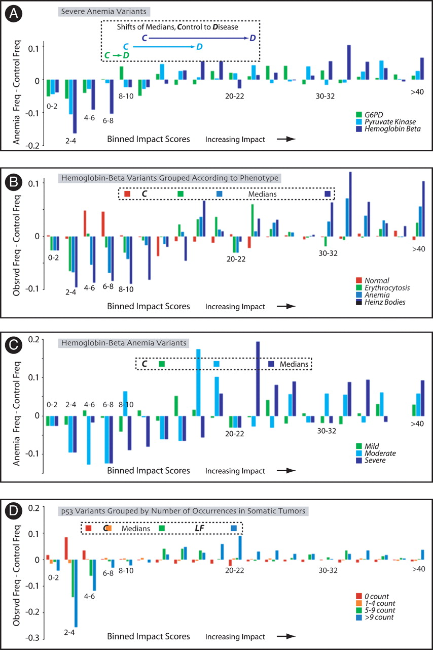
MAPP score distributions of disease variants grouped by severity of disease. Frequency differences between classes of variants and their respective control distributions are computed and shown as in Figure 2. Median scores of the original distributions are shown above the score bin into which they fall. (A) Frequency differences between distributions of anemia variants that cause hemolytic anemia and control distributions, for G6PD (green), pyruvate kinase (light blue), and β hemoglobin (dark blue). The shifts in medians from the control distribution (C) to the disease distribution (D) are indicated above their bin. (B) Comparisons among score distributions of β hemoglobin variants. Frequency differences and median scores are shown by phenotype (normal, red; erythocytosis, green; anemia, light blue; Heinz bodies, dark blue). (C) Comparisons among score distributions of β hemoglobin variants that cause anemia, graded by severity of the disease. Frequency differences and median scores are shown by severity of anemia (mild, green; moderate, light blue; severe, dark blue). (D) Scores of p53 variants isolated from somatic tumors. Frequency differences from control, and median scores, are shown for variants stratified by incidence (score 0, red; scores 1–4, orange; scores 5–9, green; 10+, blue). C indicates median score for control distribution; LF, median score for distribution of Li Fraumeni variants.