Figure 3.
Scatterplot of uncorrected HT for the HapMap data (x-axis) and the Perlegen data (y-axis). Each circle represents a 500-kb window, and the plot depicts the entire HapMap and Perlegen genome-wide samples.
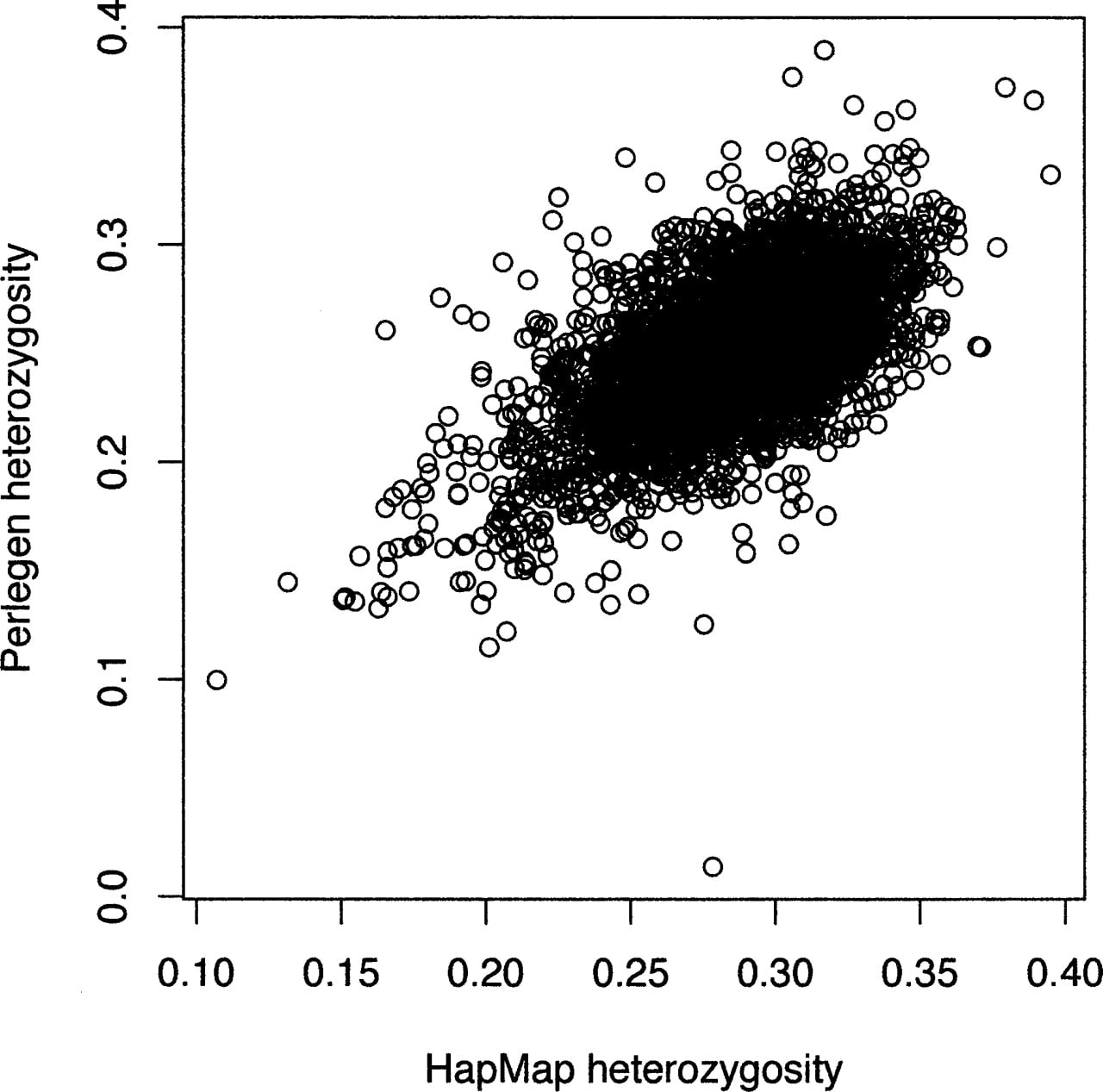
Scatterplot of uncorrected HT for the HapMap data (x-axis) and the Perlegen data (y-axis). Each circle represents a 500-kb window, and the plot depicts the entire HapMap and Perlegen genome-wide samples.