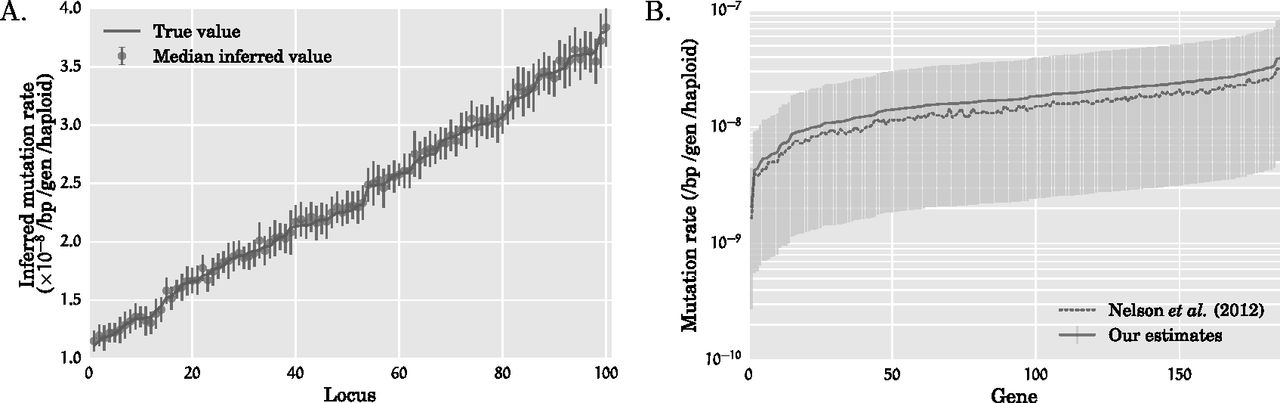
Mutation rates inferred by our method. (A) Inferred mutation rates for simulated data sets with 100 loci from 10,000 diploids under Scenario 1 with t1 = 100 and r1 = 6.4%. The mutation rates at the 100 loci were drawn randomly from the range [1.1 × 10⁻⁸, 3.8 × 10⁻⁸]. The loci are sorted in ascending order of the simulated mutation rates. The increasing solid line indicates the mutation rates used in the simulation, while the circle and the vertical bars, respectively, denote the median and one standard deviation of the inferred mutation rate over 100 simulated data sets. (B) Inferred mutation rates for each of the 185 genes in the exome-sequencing data set of Nelson et al. (2012). The solid line connects our point estimates for the mutation rate, while the light vertical bars denote 95% confidence intervals that were constructed by a resampling block bootstrap procedure with 1000 bootstrap samples. The dashed line connects the point estimates of the mutation rate inferred by Nelson et al. (2012). While the mutation rates estimated by our method and that of Nelson and coworkers are very close to each other, the mutation rates estimated by our method are systematically higher at each locus owing to the lower population expansion rate inferred by our method.