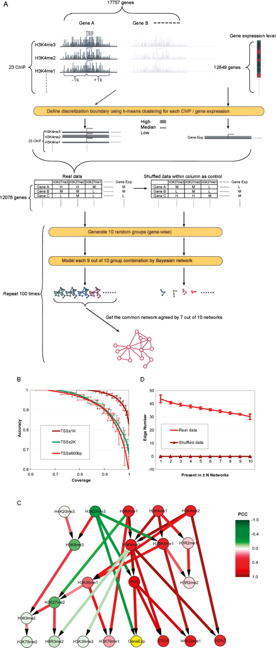
Causal relationships among histone modifications and gene expression. (A) Flowchart of a Bayesian network construction using sequence counts within TSS ± 1kb. See text for details. (B) The coverage and accuracy of models derived from sequence counts within TSS ± 600bp, TSS ± 1kb, and TSS ± 2kb. For each N (an integer from one to 10) nine out of 10 group combinations, the models’ accuracy and coverage are calculated generating a curve for each sequence range used to construct the models. We performed random grouping 100 times, and hence, the coverage and accuracy at each N is the average of 100 trials. The vertical and horizontal bars on the curve denote the standard deviations of accuracy and coverage at each point. (C) The common Bayesian network (see text for details) consisted of only compelled edges agreed by all 100 trials. The model is based on the sequence counts in TSS ± 1kb. The edge colors indicate the correlations (measured by Pearson correlation coefficient [PCC]) among the various modification/binding factors; nodes are colored by their correlation to gene expression. Colors are scaled as shown in the color legend. The edge directions have the same meanings as in Fig. 1B. (D) The causal relationships in the Bayesian network model are not expected by shuffled sequence counts among genes for each ChIP. Comparing to that of the real data, when the sequence counts are shuffled among genes, each Bayesian network contains zero compelled edge. Each point on a curve represents the average results of 100 tests or 100 simulations, with the vertical bars on the curve denoting the standard deviations at each point.