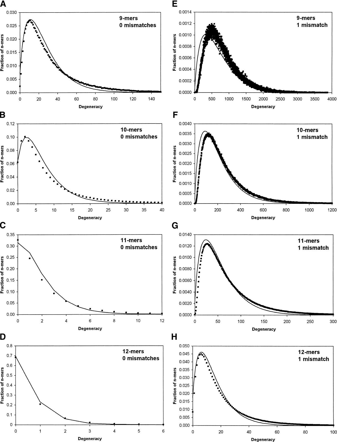
Comparison of degeneracy histograms determined from actual yeast genomic sequences (square markers) with predictions of the analytical model (continuous line). Each histogram shows the fraction of n-mers having a given degeneracy value. Predicted curves were obtained by taking a weighted average of Poisson distributions as in Equation { label needed for disp-formula[@id='E1'] }, with the weights corresponding to the distribution of transcript lengths in yeast. There are no fitted parameters. Actual histograms were generated with custom computer software that counted the degeneracy of each n-mer in the yeast genome. (A–D) Histograms for the case of 0 mismatches forn = 9, n = 10, n = 11, andn = 12, respectively. (E–H) Histograms for the case of 1 mismatch for the same range of n-values.