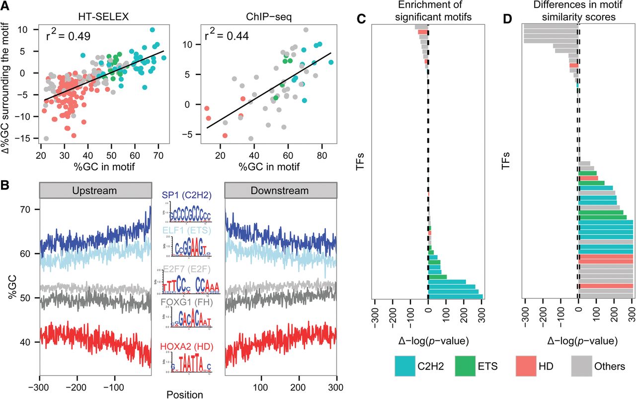
Differences in motif similarities. (A) Correlation between %GC of the bound motifs and Δ%GC surrounding bound compared with unbound motifs, in vitro (left) and in vivo (right); black line shows the linear regression trend line. The r2 of the trend line is shown. The TFs are colored according to the color code used for TF families: cyan for C2H2 TFs, green for ETS TFs, red for homedomains, and all others in gray. (B) %GC upstream of and downstream from motifs found in sequences bound by SP1 (dark blue), ELF1 (light blue), E2F7 (light gray), FOXG1 (dark gray), and HOXA2 (red). Logos of the TF-bound motifs are shown in the center: A and T bases are colored in red; G and C bases, in blue. (C) Wilcoxon test P-values comparing the number of significant motifs, including weak motifs (FIMO P-value cutoff of 0.001), found in the regions surrounding in vivo bound and unbound motifs. The bars to the right side represent TFs having higher motif counts in their bound sequences, while bars on the left side represent TFs having a lower number of motifs in their bound sequences. The height of the bar represents the significance of the differences. The dashed line represents the significance cutoff using the shuffled data. The TFs are colored according to the color code used for TF families: cyan for C2H2 TFs, green for ETS TFs, red for homedomains, and all others in gray. (D) Comparison of the PFM similarity scores between sequences surrounding in vivo bound and unbound motifs. The bars on the right side represent TFs having higher motif similarity scores in the bound sequences, and bars on the left represent TFs having lower similarity scores in the bound sequences. The height of the bar represents the significance of the differences. The dashed line represents the significance cutoff using the shuffled data. The TFs are colored as in panel C.