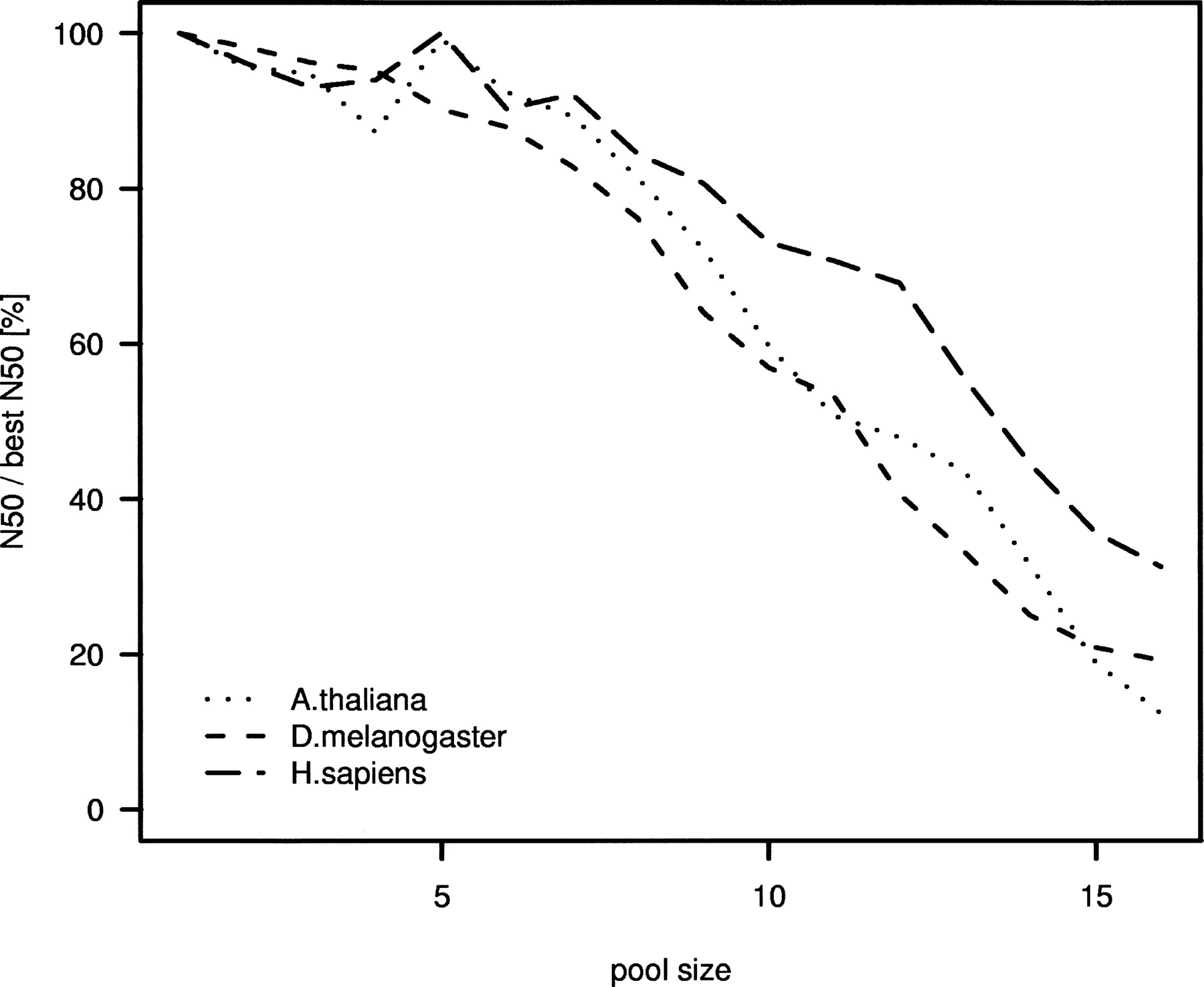
Figure 5.
Summary of decrease in N50 size due to pooling (for corresponding coverages, see Fig. 4). The plot compares N50 values for a given pool size with the optimal N50 achieved for pool size 1. The lines show the average fraction of N50 per pool size divided by the optimal (“best”) N50. For each pool size, we average over 20 BACs and three simulations each, using the same data as in Fig. 4.